Menu
Follow us on:

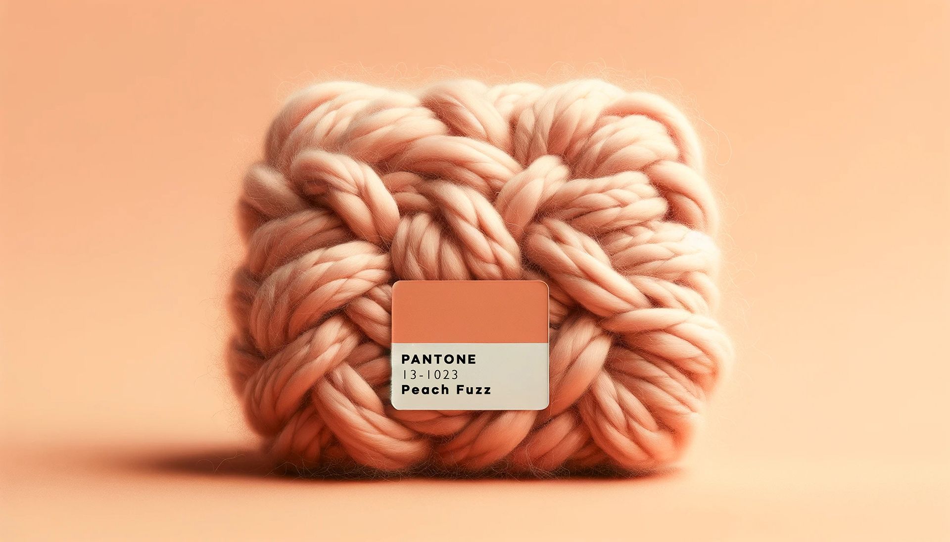
PANTONE COLORS OF THE YEAR 2021 – ILLUMINATING & ULTIMATE GRAY
Each January, Pantone announces the color of the year that reflects forecasted color trends in fashion, beauty, and design. This year and for the second time ever, two colors have been selected as colors of the year.
These colors are:
Illuminating – a vibrant/sunny yellow.
Ultimate Gray
– the first achromatic shade to ever be selected.

Why two colors? According to Leatrice Eiseman, Executive Director of the Pantone Color Institute, these two colors were chosen because “the union of an enduring Ultimate Gray with the vibrant yellow Illuminating expresses a message of positivity supported by fortitude. Practical and rock solid but at the same time warming and optimistic, this is a color combination that gives us resilience and hope. We need to feel encouraged and uplifted; this is essential to the human spirit.”
K4 focuses on creating personal and branded spaces for our clients, so the colors of the year do not have much of an impact on our design process. Longevity is also a key issue we consider while designing. We want to create long lasting & timeless facilities for our clients versus short-term trendy spaces. While neutrals such as Ultimate Gray are staples in our designs, it is not common for us to use yellows unless part of a clients branding, as colors like Illuminating err more on the trendy side of design. While colors such as Illuminating may not be typical in our designs, they can still be incorporated into interior spaces in moderation.
Color is a crucial part of interior design and does more than just make a space look aesthetically pleasing. Color greatly impacts the environment in which its used and the people within.
- Color can affect people’s moods, behaviors, and emotions.
- Color enhances experiences but can also produce negative effects on the people in the space when not applied properly.
Considering Illuminating in your design?
- The color yellow is most often associated with happiness, sunshine, and warmth.
- Pantone describes Illuminating as “a bright and cheerful yellow sparkling with vivacity, a warming yellow shade imbued with solar power,” meant to be the light at the end of the tunnel after the obstacles we faced in 2020.
- Yellow is the most luminous color on the spectrum- the human eye processes yellow first, therefore it is the most eye catching. You want to be very careful about using too much yellow in interior spaces.
- It’s also important that the right shade of yellow is selected for interior spaces. You don’t want a yellow that is too dingy and dull, but also not too bright.
- Too much yellow or a shade of yellow that is too bright can cause irritability, anxiety, and over stimulation.
- Yellow is best used in small accents to give bright and cheery pops of color, not so great in large amounts, especially on walls.
- If you want to use yellow in your space for a splash of warmth, I recommend incorporating it into artwork, graphics, and fabrics.
Considering Ultimate Gray in your design?
- In contrast to yellow, gray is often perceived as a more grounded color. It is neutral and steadfast and doesn’t invoke the same feelings of warmth and energy that yellow does.
- Pantone describes Ultimate Gray as “emblematic of solid and dependable elements which are everlasting and provide a firm foundation. The colors of pebbles on the beach and natural elements whose weathered appearance highlights an ability to stand the test of time. Ultimate Gray quietly assures, encouraging feelings of composure, steadiness and resilience.”
- Grays have been very on trend for the past several years, but will also always be in style, even as we move on to other trendy neutral colors.
- Extremely versatile color that can be used in virtually every aspect of design.
- Darker grays can be moody and dramatic, while lighter shades can create cool and calming feelings in a space.
- Gray also pairs very well with texture. Texture adds depth and interest to an otherwise simple color.
- Gray can be incorporated into interiors in so many ways. It’s an extremely popular paint color, as both a primary and accent paint. popular in textured wallcoverings, carpet, and fabrics.
How about both?
- Together, in the right shades and applications, yellow and gray can give off a subtle and sophisticated feel or a bold and dramatic vibe.
- A good rule of thumb is to use a balanced palette, which is a 60:30:10 ratio. 60% dominant color, 30% secondary color, and 10% accent color . Yellows such as Illuminating are best used as a secondary or accent colors, while neutrals, such as Ultimate Gray, are a great dominate color when paired with bright eye-catching colors.

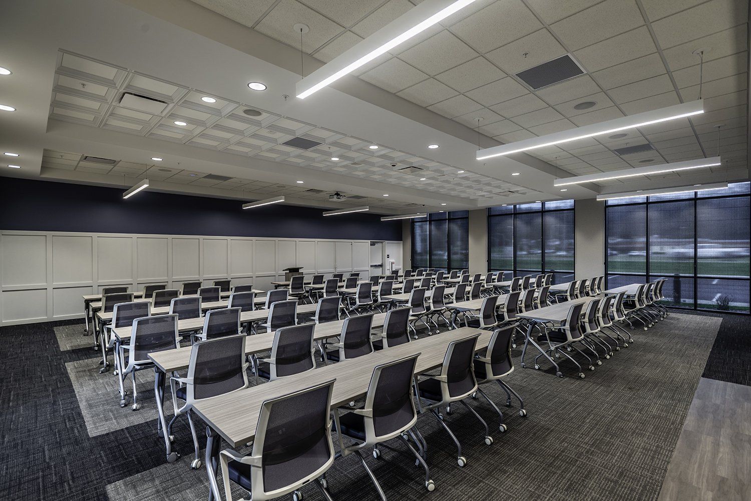
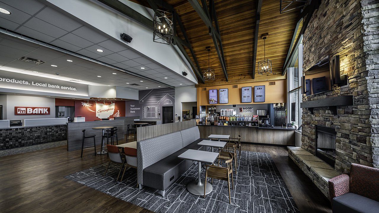
K4 Project – Dynamic Federal Credit Union – Celina, OH
As previously stated, designs for our clients are based on their brand elements. So while Pantone’s Color of the Year may not have a huge influence on K4 interior design projects, it is a fun thing to look forward to each year and to incorporate into décor items that can be easily updated and replaced, rather than long-term design solutions.

K4 Project – Dynamic Federal Credit Union – Celina, OH