CANSTRUCTION CINCINNATI: A BEHIND THE SCENES LOOK

As most of the U.S. has been consumed with March Madness; vigorously filling out brackets by tracking player statistics, loyally standing by your alma mater, or choosing teams based on most stylish uniforms, we at K4 have been involved in some madness of our own.  Since November we’ve been scouring the grocery store aisles for the perfect canned food labels and weighing, measuring, and comparing various cans to see how they stack up against each other (literally) in preparation of the 2014 Canstruction  Cincinnati competition.


Canstruction is an international community service project of the design and construction industry to benefit community food banks. Architects, engineers, designers and contractors compete to design and build fantastic giant-sized structures made entirely out of canned foods. After the structures are built and the winners declared, the creations go on view to the general public as a giant art exhibit. At the close of the competition, all of the food used in the structures is donated to the local food bank for distribution to community emergency feeding programs..


Now that the 48,586 pounds of canned food collected this year are safely stacked at the Freestore Foodbank, I thought I would give you a behind the scenes look at what led to the design, build out, and award win of our Canstructure – “Fighting Hunger One Fork At A Time.

The Big Idea.


The brainstorming part of the process started with research of past Canstruction entries. We found plenty of beloved cartoon characters, masterpieces of art and architecture, and even a slinky – one of my personal favorites. So we teamed up with our friends at HGC Construction and came up with some team goals to successfully move from the sketch phase to the final product; while keeping our eye on the Canstruction four award categories of Structural Integrity, Best Use of Labels, Best Meal, and Jurors’ Favorite.

The well known architectural theory of Vitruvius relies on the relationship of firmitasutilitas, and venustas – for you Latin fanatics and for everyone else – structural stability, commodity, and beauty. We wanted to maintain these three principles, similar to the four Canstruction award categories, throughout our design.


Our second goal was to recognize the big picture – the Canstruction Cincinnati inspirational motto, “One Man Can’ be a catalyst for change.” We wanted to use our design to remind people about the purpose of Canstruction. By modifying the iconic machine, the forklift used frequently on our job sites, to include an actual utensil that is used every day during mealtime, we hoped to spark peoples’ curiosity and challenge them to think differently. Just as viewers may not expect a heavy duty forklift to be pulling vegetables out of the ground, they may not realize how easy it is to make a difference in the fight against hunger. It doesn’t take heavy duty machinery or a great effort to help feed the people right in our own communities and neighborhoods. One person can make a difference in someone’s life and we can “Fight Hunger One Fork at a Time.”

Doing What Architects Do Best.


So we decided on a design direction, took the plunge, and drew up some plans. Collaboration and coordination were key. On build day, your team of 5 is only allowed 5 hours to complete the structure. We made sure to have a “floor plan” of the ground so we knew how high to build the ground by how many tuna can spacers to add to each Bush’s baked beans can. For the cab, we used a color-coded plan of each layer so you knew the exact number, color, and location of cans needed for each layer. This sped up the process and kept everyone busy. We squeaked by with only 12 minutes to spare.

The Game Changers.


The Canstructure elements below provided unforeseen challenges for us as well as learning experiences.


The Forklift Cab – This was fairly simple and carefully planned out, a great teaser of what was to come. Now we had to work on cantilevering the fork “through” an 8 foot tall carrot and fight gravity to make the tire round


Carrot – Whenever you have a small base (6 cans) supporting a larger top (largest diameter 21 cans), structural integrity becomes an issue. Careful placement and a steady hand were essential in building the carrot.


Fork – In order for the fork to look like it was actually pulling the carrot out of the ground, we needed to get the angle of the fork just right. We used sardine cans for their silver color, the tin can which was easy to Velcro without destroying the label and their light weight. Again we wanted to make this look like an actual utensil, so we added some texture to the handle by adding small round cans to make it as close to fine china as you can get with canned goods. This design also makes a pretty cool t-shirt…

Tire – One of the most important rules for Canstruction is to keep the label on the can intact. So that basically threw out Velcro and tape of any kind. So we turned to the Internet and Robby Blum tracked down some heavy duty magnets. We designed a 3 layer frame out of Masonite to hold the cans in the middle of the tire and used magnets around the outside for the Ranch style beans. We had several unsuccessful attempts with the number and location of magnets, as well as a few minor injuries (glue gun burns), that led to finally successfully maintaining the radius of the tire with the cans.

And the Winner Is….


The combined effort of K4 & HGC and commitment to our planning process, attention to detail, and variety of food options chosen, helped us to distinguish our Canstructure from other competing entries and led to the win of the ‘Best Meal’ category.

It was a fun experience that put our creativity and problem solving skills to a new test, always a welcome challenge for design professionals.


Can’t wait til next year….

Still want more Canstruction action? Watch this video to see the build out in progress.
By Jeff Klump 20 Dec, 2023
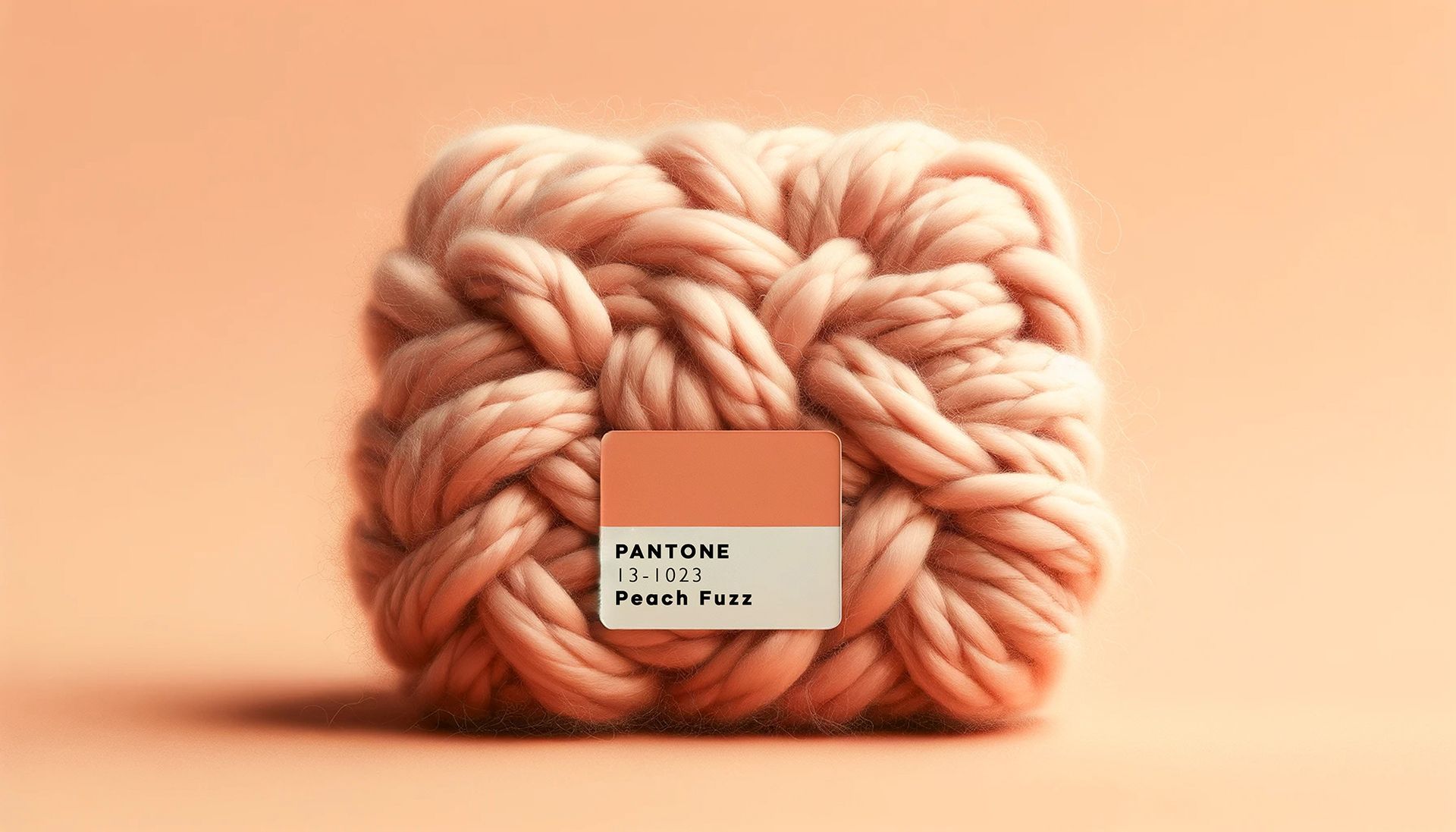
In the dynamic world of corporate office interiors, staying ahead of design trends is crucial to creating spaces that not only inspire productivity but also reflect the latest aesthetic sensibilities. As a firm specializing in corporate office design, K4 embraces Pantone's Color of the Year for 2024 - Peach Fuzz. This warm and inviting hue offers a fresh perspective on creating contemporary workspaces that balance sophistication and comfort and an opportunity to infuse sophistication, and a touch of modernity into the corporate design landscape. Peach Fuzz, a delicate and nuanced shade blending peach and blush, brings a sense of tranquility and optimism to any space. When incorporated into corporate office interiors, this color has the power to redefine the atmosphere, promoting a positive and collaborative environment. K4 is committed to enhancing the workplace experience, and we recognize the significance of color in influencing mood and productivity.
By Jeff Klump 07 Nov, 2023
In the dynamic landscape of community banking, where the strength of relationships is paramount, the role of design extends beyond aesthetics—it becomes a strategic catalyst for talent acquisition and retention. In an era where attracting and retaining top talent is pivotal for organizational success, the significance of an intentionally designed workspace cannot be overstated. In this article, we delve into how strategic design decisions can not only enhance the physical environment but also foster a culture of engagement, innovation, and long-term commitment among employees, contributing to relationship building and the overall prosperity of community banks. Join K4 on this journey through the intersection of design and community banking, where the blueprint for success lies in the spaces we create for those who make our banks the heart of the community.
By Nicole DeRogatis 07 Nov, 2023
In the previously published Journey to Brand Consistency: Part I, K4 addressed Facilities, Marketing & People as the three pieces that comprise the Financial Success Puzzle for community banks. This article examines one level deeper in unifying physical and digital marketing assets within the Financial Success Puzzle, and the importance of creating a harmonious and powerful brand identity across all platforms. In the fast-paced and ever-evolving community banking industry, maintaining a strong and recognizable brand presence is vital for success. As a full-service design and branding firm working closely with community banks, we have witnessed the transformative power of consistent marketing assets in bridging the gap between the physical and digital realms. By solidifying the customer experience across all touchpoints, banking institutions can establish a stronger emotional connection with their customers and create a lasting impact on their success. Investing in brand consistency is not only a strategic move but also a reflection of a bank's commitment to their own stability and future growth.
By Jeff Klump 07 Nov, 2023
Now more than ever, brand consistency is of utmost importance to financial institutions. Creating brand consistency goes a long way in building brand trust, increasing customer/employee/community loyalty, and impacting your bottom line. Why is there so much brand inconsistency in the community banking landscape? Because being brand consistent requires change and commitment, and it can be tedious and expensive. Taking the first step is often overwhelming. Where do you start? What do you update first? These are excellent questions, but there are other important questions to consider. What is the cost of NOT getting brand consistent or what is the cost or potential loss of creating brand confusion? Inconsistencies are costing your bank time and money. Not practicing brand consistency will cost you significant consequences to customer experience, brand reputation, and overall loss of trust – all of which can impact your bottom line. Conflicting brand usage accounts for a damage to brand credibility, making it harder to compete in the market. As K4 gets ready to hit the road in 2023, presenting at various community banking conferences on this topic, we thought it was important to preamble this timely subject of the Financial Success Puzzle. At K4, we define the Financial Success Puzzle as a 3-piece formula to creating and maintaining brand consistency for community banks. This formula is simply the act of connecting people to place and connecting brand identity to place. Many retailers have capitalized on this concept for years. Your branch facilities, marketing & people MUST work together to create stability and not only that…they must be triplets, not just siblings. They can’t just resemble one another; they need to be nearly identical in their delivery.
By Jeff Klump 08 Dec, 2022
For decades, small town business districts across America have featured a strong physical presence from a local bank perspective. Near the courthouse or city hall, these buildings are often identified by their traditional columns and prominent facades of brick or stone. Not only do these structures help establish the fabric of the streetscape; they often contribute to defining the social framework of the residing individuals and neighborhoods, supporting the hopes and dreams of generations. Community banks need to continue to reinforce their presence and values to those individuals and businesses in the geographic areas they serve. Making your bank’s physical appearance memorable, builds brand awareness and offers an opportunity to reinforce the benefits of banking locally which includes working with trusted friends and neighbors. Many community banks are exploring ways to create community space by revitalizing main offices and branch experiences while positioning themselves as a valuable and integral local resource.
By Jeff Klump 07 Nov, 2022
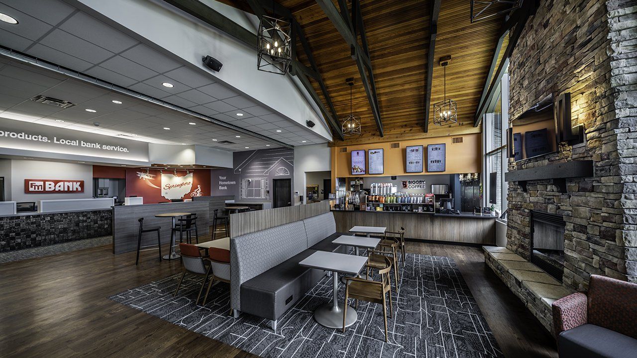
Let’s first explore how the definition of the coffee shop has evolved…from simply being a beverage offered at a restaurant to an actual stand-alone destination, service and experience that provides and encourages co-working space, meeting opportunities, and community gathering.
27 Jun, 2022
Each January, Pantone announces the color of the year that reflects forecasted color trends in fashion, beauty, and design. This year and for the second
27 Jun, 2022
Helping customers feel at home at your bank can increase the likelihood they’ll come inside and want that personal connection with your branch. There’s a
27 Jun, 2022
Interested in learning about Post Pandemic Design Solutions? Read below for details. We do not have a crystal ball or be able to see into
27 Jun, 2022
How Credit Unions Can Connect to the People They Serve. For decades, small town business districts across the country have almost always featured a strong
Jun 21, 2022
Share by: