Menu
Follow us on:
SCARY DESIGN MYTHS AND HOW TO SOLVE THEM
Design Debunked: K4 designers discuss two common design myths.
Ever wonder what design myths K4 designers come across on the daily? In this blog post K4 designers break down two common design myths that they experience in the field – and how to solve them.
Kelli Plummer – Designer
Creatively designed spaces aren’t particularly useful.
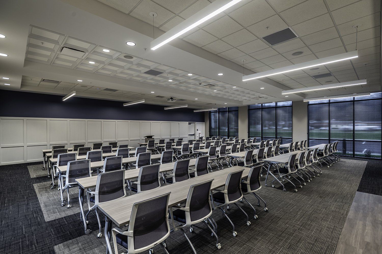
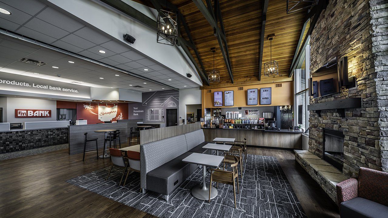
While this may not be a myth for some big-time designers, many architects and interior designers live with the need for form and function to work in harmony. In my experience, a space must be functional to be considered a good design. A space utilizing sharp angles and curves can be innovative and creative but tends to create areas of dead space that typically cannot be used for any purpose. It is in places like these that designers must look at how to incorporate strategies to bring these artistic pieces into the use of the space. For example, a branch we recently designed for Centra Credit Union uses a curved wall for both aesthetics and to display graphics, a digital monitor, and a service panel for the function of the space. This curve also enhances the design of the space, mimicking the flow of the room that was created.

Centra Credit Union, New Albany, IN – Author’s own photo
In the case of using curved walls, focal walls can be significant in these areas as well as defining the sense of the space. If you were to use a curved wall as a wayfinding area, waiting area or even a separator wall between two spaces, it gives the design a different element and can have a large impact on the feel of a space. Instead of being a hinderance to the overall function of the design, this curved wall becomes a statement piece and topic of conversation in the design. It is imperative that designers think of both the form and the functionality of their designs during the design process to achieve the goals of the project.
Rachael Ruschke – Marketing Coordinator / Graphic Designer
Graphic design just makes things look pretty.
While this is, in a way, is a myth that can be true on the surface, there is much more functionality and purpose behind the graphics you see in a space than just making things look pretty. Your brand is the first experience your customers have with your financial institution, whether that is through a brochure, your website, or in a physical branch. The message you convey with your brand – from your website to printed marketing materials to the graphics in your space – can set the tone for your business.
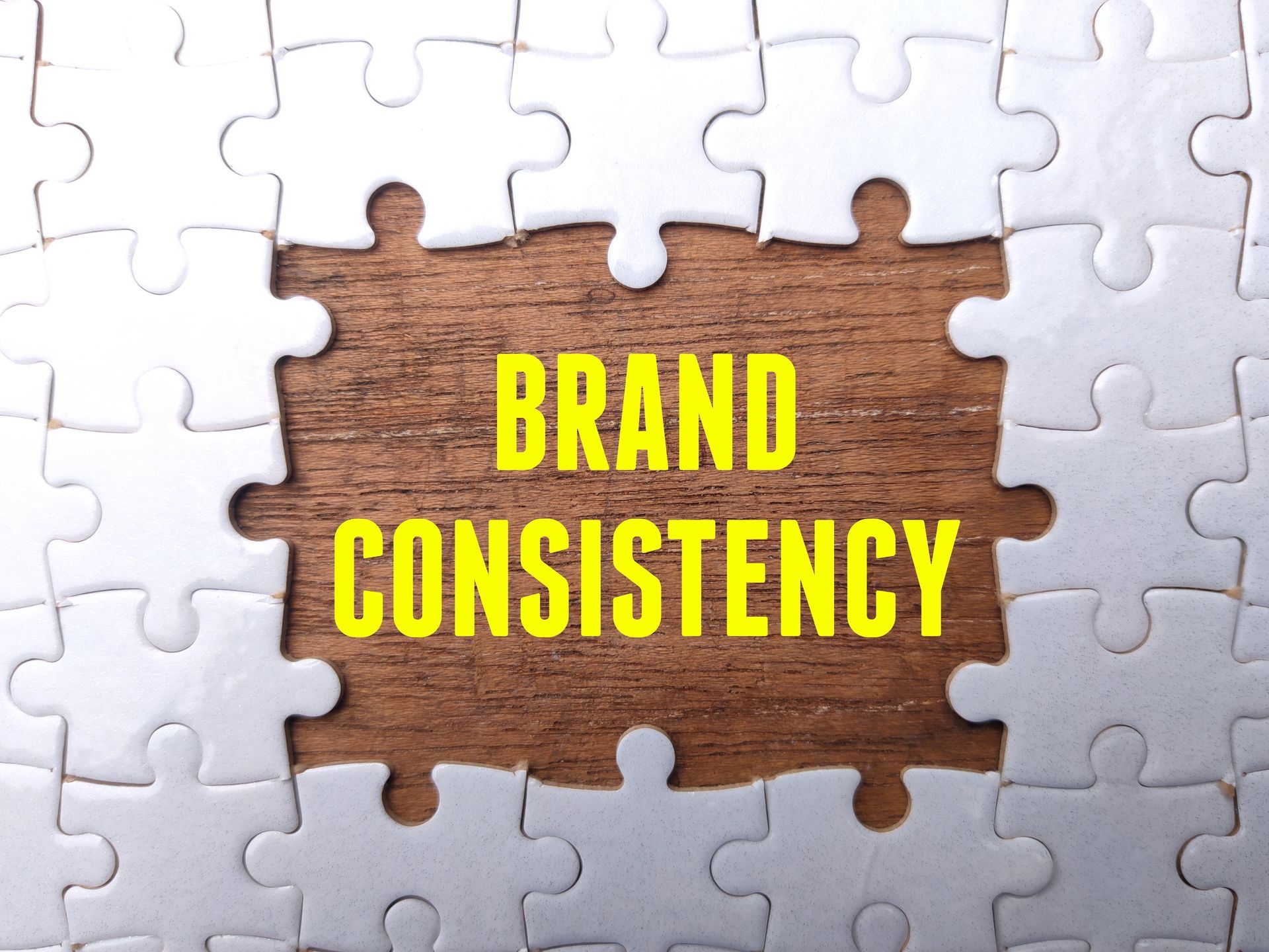
Strategically placed graphics can not only dress the space up, but it can also highlight your brand and create that sense of brand consistency. It all goes back to brand recognition – can your customers recognize your brand and your branch by your building and what is inside?

Centra Credit Union, Jeffersonville, IN – Bella Photographics
Does your financial institution set you apart from other banks, and show that you are there to stay? A history or community wall can offer an opportunity to celebrate your place in the community and the role you have played in the town’s growth. It engages your customers and shows that you value the community you are in.

Wayne Bank & Trust, Cambridge City, IN – Bella Photographics
Graphics not only make your space “pretty,” but they also serve a higher purpose of working towards brand recognition, brand consistency and showing customers you value your place in their community. Graphics, marketing, and branding all work together to create the message you want to be sending your customers.
These design myths shouldn’t be scary, and believing them can limit the potential of your brand and your space. Have any other design myths you’d like to debunk? Drop us a line!